Colour grading black & white images in Lightroom is apparently a thing – Here’s how to do it
This kind of struck me as a little bit weird at first. Mostly because it was something I’d never even considered. Toning, sure, but split toning the shadows and highlights separately on a black and white image that doesn’t actually have any native colour whatsoever? Yeah, kinda weird. But the more I watched this video from photographer Anthony Morganti, the more it intrigued me.
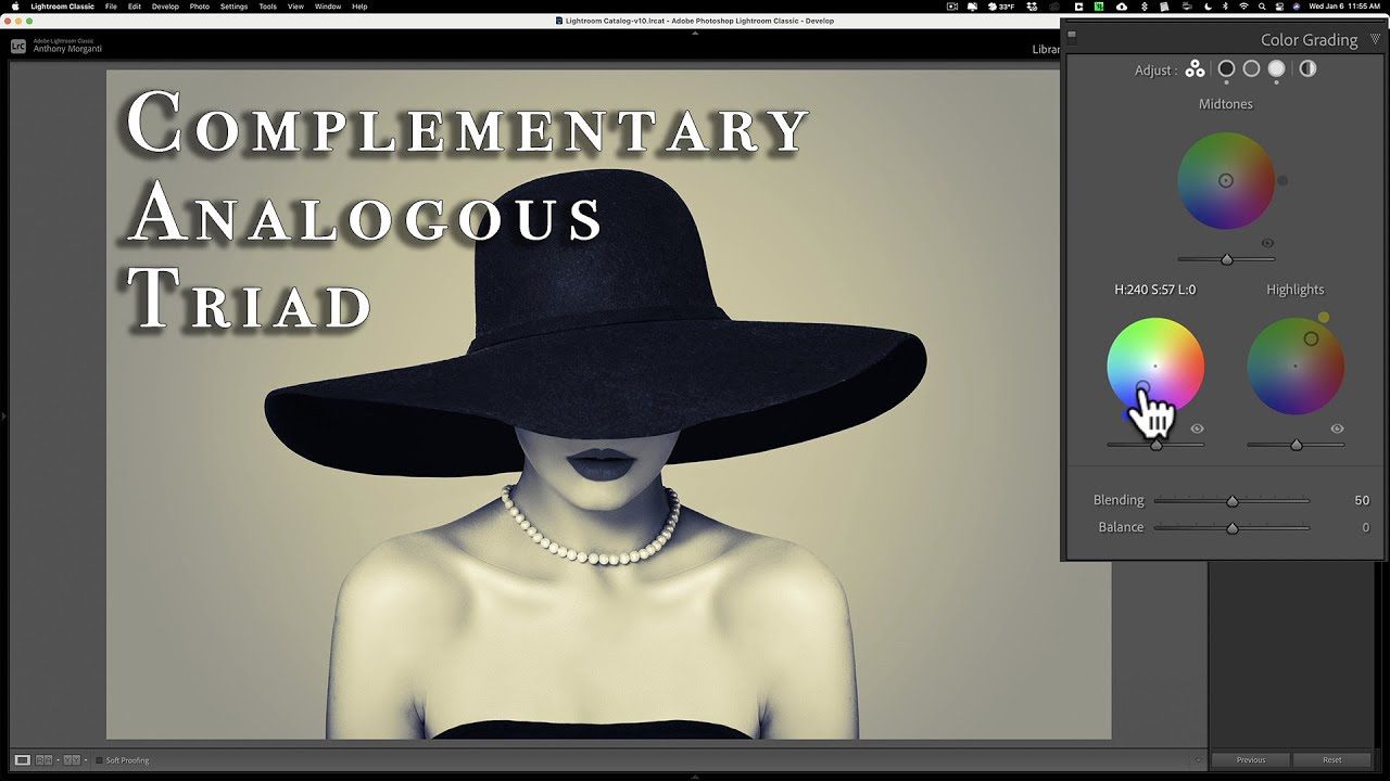
It’s an interesting idea, to add colour to a black & white image – and not in the colourising sense, but doing the same kind of shadow and highlight tints we might typically do to a colour image or video sequence. For stills, though, in Lightroom, it’s pretty easy to do, too.
In the 8-minute video, Anthony goes over the process multiple times. It’s not that it’s a difficult or complex process (it only really takes advantage of Lightroom’s “Color Grading” tab), just that there’s a lot to colour theory and figuring out what goes with what. So, Anthony uses different image examples to talk through complementary colours, triad colours and analogous colours.
I’m not sure it’s a technique I’d want to employ often in my own imagery – at least not for black & whites – but it is a pretty interesting technique that can add new dimension to your otherwise mono shots.
Is this a technique you use with your black & whites?


