Subject-Background Harmony – Outdoor Photographer
Discord produces chaos. In photography, this is bad. Learn how to create harmony to blend all aspects of your compositions.
Harmony:
A consistent, orderly or pleasing arrangement of parts.
The combination of simultaneously sounded musical notes to produce chords that have a pleasing effect.
Husbands and wives need to live in harmony to stay together; politicians should live in harmony to solve problems and come to compromises; peace and harmony go together so all people everywhere around the globe can get along. As you can infer, when harmony exists, everything fits like pieces of a puzzle. Harmonic musical notes strengthen a song, harmonic colors seamlessly blend and, in regard to photography, a successful harmonic image allows the subject and background to come together as one.

Bad background.

Good background.
Discord is the opposite of harmony. If one bangs random notes on a piano, discord is created. In social media, posts that show polar opposite opinions are filled with discord. As you can infer, discord isn’t something positive. If you’re reading this, obviously you are into photography. So why is it that photographers allow discord into their photographs? This question is rhetorical, but it needs to be contemplated to prevent imperfect images from being created. When an acapella group sings in five-part harmony, we watch and listen in awe as the tones seamlessly blend. In the same vein, the primary subject and background in a photo should blend harmoniously. The goal is to create images where viewers stop in their tracks and stare at your photos.
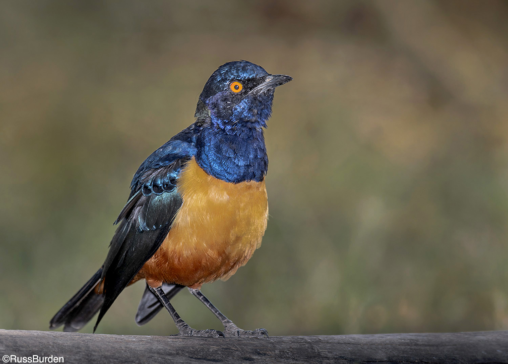
Harmonious backgrounds are created when the background is KISS—Keep It Simple and Sweet. The background allows the subject to come forward in the image. This allows it to stand out. The subject pops forward and the background recedes. This is so important, I want to emphasize it: The subject pops forward and the background recedes. One way to accomplish this is to use color to separate the subject from the background. Use complementary colors that are close to the hue of the subject or use colors on the opposite side of the color wheel for contrast.

Bad background.

Good background.
Another way to have the subject pop is done through exposure. Backgrounds that are decisively darker than the subject become less important since they’re dark. Dark backgrounds tell the viewer those areas aren’t significant. As a result, the bright subject takes on dominance. An additional tactic that makes the subject pop is via the use of depth of field. The more the background is out of focus, the more it sends a message to the viewer it’s not significant. Hence, a tack-sharp subject offset against an out-of-focus background allows the subject to stand out.
A third approach is to use the sky as a background. Skylined subjects take on dominance for two reasons. The first is obvious in that the subject is simply offset against a field of blue. There’s nothing to distract the viewer from seeing the subject pop. The second reason comes from psychology and you’d be surprised at how much the images you make are impacted by this science. If a subject is skylined, in all but a few cases, you have to point the lens upward to make a skylined photo. This means you “have to look up at the subject.” Psychologically, when you “look up at someone” admiration and recognition are introduced. The viewer unconsciously sees this and unknowingly applies admiration and recognition to the subject.

Bad background.

Good background
Create harmony between your subject and background. I have many business tag lines that I use in the field when I run a safari. One is, “The Background Is Equally As Important As The Subject.” This weeks’ tip is a testament to those words.
Visit www.russburdenphotography.com for information about his nature photography safaris to Tanzania.
Originally Published October 27, 2020

